Branding the can.
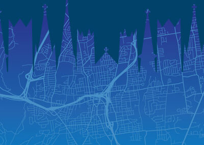
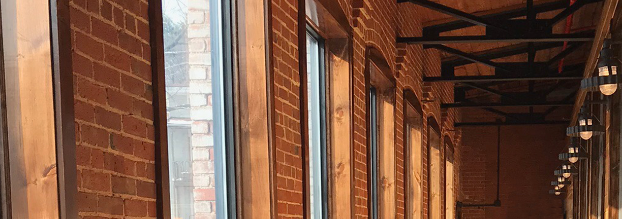
Five Churches is a craft brewery operating out of a renovated factory building in downtown New Britain, Connecticut. From the beautiful oversized windows of the second-floor taproom you can see the steeples of five churches in the city skyline. The brewery had the key elements of their visual brand in place when we first met with them. They had worked with other designers to develop a logo and website. They called on us to develop a design system for labeling their product for retail sale.

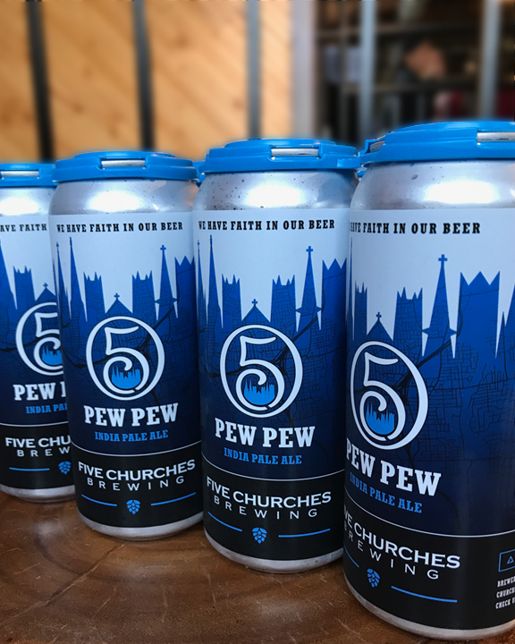
The team at Five Churches not only have a passion for their craft, but they have a true love for their city. Our label design wraps the can with a street map of New Britain encased in the silhouette of the steeples that inspired the brewery’s name. Their logo mark is strategically placed on the brewery’s downtown location.
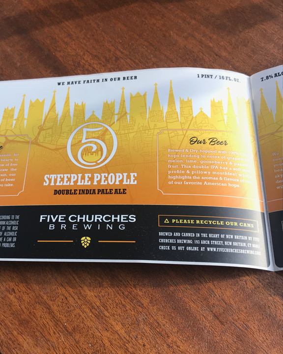
The subtle gradation, elegant steeples, and classic typography reflect the sophistication of the Five Churches tap room. This design is used for the brewery’s signature line.